Most gallery walls start with good intentions and end with a cluster of uneven frames that looks more like a college dorm than an interior design magazine. You eyeball the spacing, hammer in a nail, step back, and realize everything is slightly off. One frame hangs too high, another tilts left, and the whole arrangement has an energy best described as "gave up halfway through."
It doesn't have to go that way. A good gallery wall follows a few concrete rules about layout, spacing, and visual cohesion. Get those right, and the rest is just hammering nails. If you need art to fill the wall, Wallora generates AI paintings in dozens of styles, so you can create pieces that actually work together instead of hunting through stores hoping to find matches.
Pick a Layout Style
Before you buy a single frame or hammer a single nail, decide on a layout. This is the decision that shapes everything else.
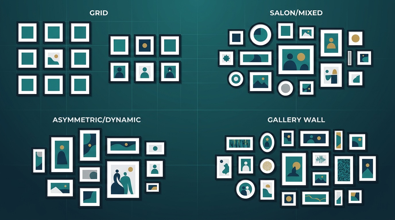
Grid. Equal-sized frames arranged in neat rows and columns. This is the most structured option and the easiest to pull off. It works with identical frames and similar artwork (a series of black-and-white photos, botanical prints, city illustrations). The grid reads as orderly and intentional, even from across the room.
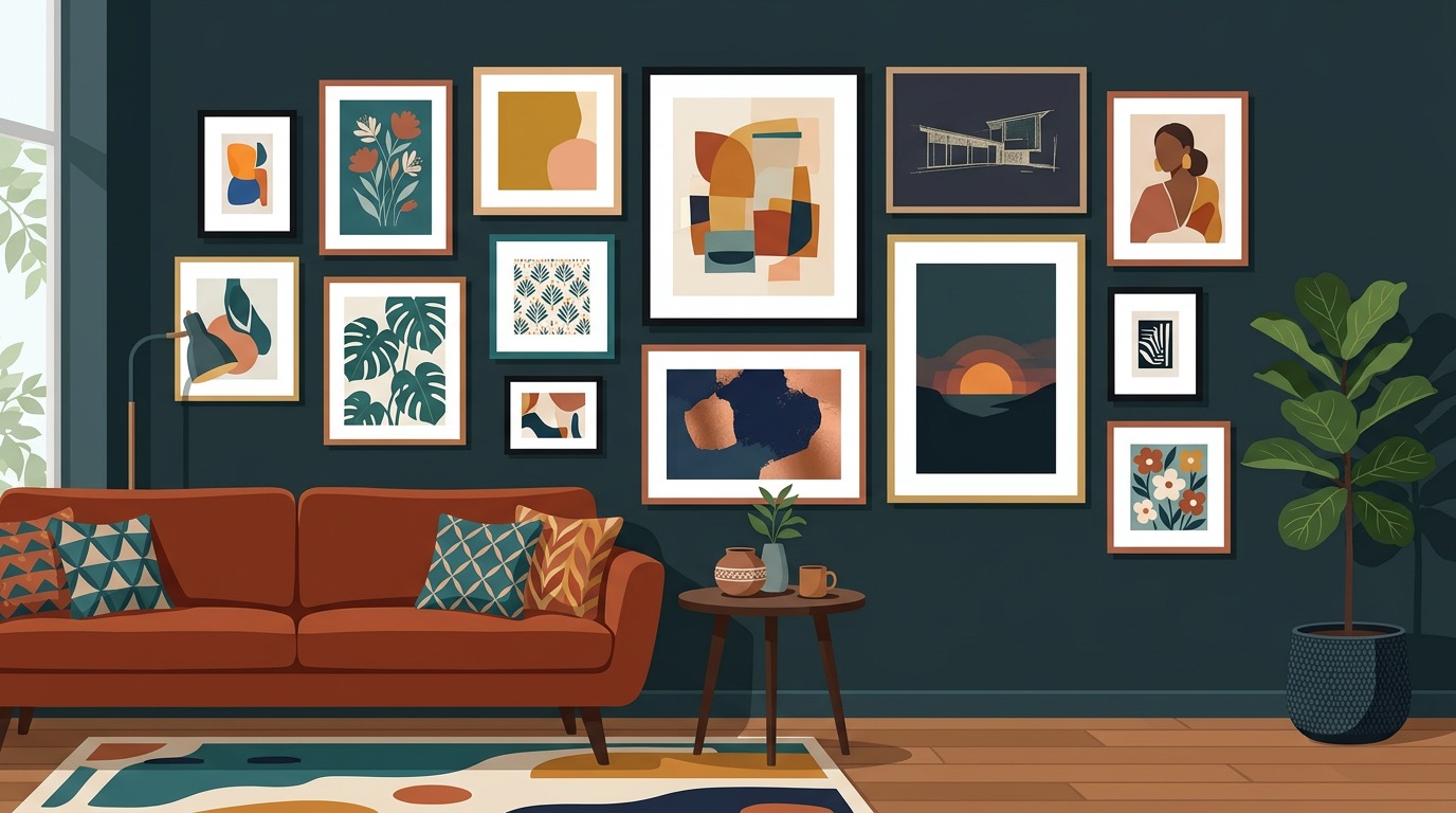
Salon style. This is the classic "eclectic mix" layout where different frame sizes are arranged organically to fill a large wall section. It looks effortless in magazines but requires the most planning. The trick is to anchor the arrangement around one or two large pieces and build outward with smaller ones.
Horizontal row. Three to five frames hung in a straight horizontal line at the same height. Simple, modern, and hard to mess up. This works especially well above a sofa, headboard, or console table where the furniture provides a visual base.
Triptych / diptych. Two or three related pieces hung side by side with tight, consistent spacing. The art reads as one connected composition. This works best with pieces that were designed as a set, or artwork that shares the same style and palette.
Vertical stack. Two to four frames stacked vertically in a column. Great for narrow walls, the space between windows, or flanking a doorway. Keep the spacing identical between each frame.
Asymmetric cluster. A freeform arrangement that doesn't follow a grid but still has visual balance. Larger pieces sit on one side, smaller pieces on the other, with the overall weight distributed evenly. This takes the most trial and error but gives the most personality.
Find a Unifying Thread
A gallery wall with random, disconnected pieces looks like a yard sale display. Every good gallery wall has at least one unifying element that ties everything together.
Frame style. The easiest approach. Use identical frames for every piece. Same material, same color, same profile width. This gives you complete freedom with the artwork itself, because the frames do the unifying work. Black frames are classic. Natural wood frames feel warm and casual. White frames disappear against white walls, putting all the focus on the art.
Color palette. Choose artwork that shares two or three dominant colors, even if the subjects and styles vary. A landscape painting, an abstract piece, and a photograph can all live together happily if they share a palette of blues and warm neutrals.
Subject matter. All botanicals. All landscapes. All portraits. All architecture. A shared subject creates instant cohesion even when styles and frame sizes differ.
Art style. All watercolors, all line drawings, all oil paintings. Consistent medium and technique links pieces that might have nothing else in common.
You only need one of these. Two is great. Three might feel too matchy. The goal is cohesion, not uniformity.
How Many Pieces Do You Need
There's a rough formula for this. Measure your wall space in square feet (width times height of the area you want to cover). Your gallery wall should fill about 60-75% of that space, including frames and gaps.
For a practical starting point:
- Small wall (under 30 sq ft): 3-5 pieces
- Medium wall (30-50 sq ft): 5-9 pieces
- Large wall (50+ sq ft): 9-15 pieces
Odd numbers tend to look better in freeform arrangements. Even numbers work best for grids and rows. A single oversized piece is always an option too, and sometimes it's the better choice over trying to coordinate a dozen frames.
If you're building the collection from scratch, start with your largest piece first. That's the anchor. Then add smaller supporting pieces around it, stepping back after each addition to check the overall balance.
With Wallora, you can generate a whole set of paintings in a consistent style. Describe a scene, pick your art style, and create pieces that share the same visual language. It beats spending weeks hunting for prints that happen to match.
Spacing and Placement Rules
This is where gallery walls go wrong most often. Good spacing is the difference between "curated" and "chaotic."
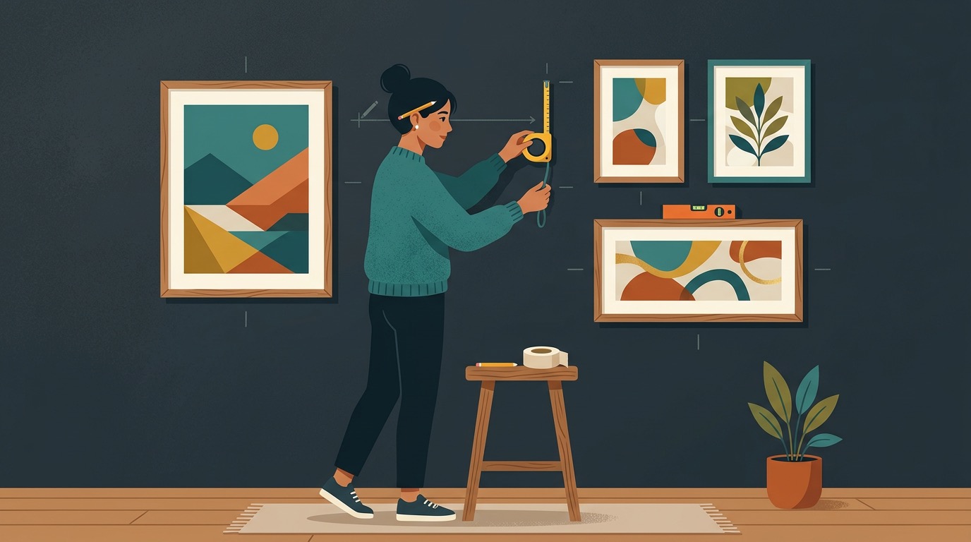
The 57-inch rule. The center of your overall arrangement should sit at 57 inches from the floor. This is standard gallery hanging height, based on average eye level. It applies to the center of the entire grouping, not each individual frame.
Frame-to-frame gaps. Keep 2-3 inches between frames. This is tight enough that the arrangement reads as one unified composition. Once gaps exceed 4 inches, frames start to look like isolated pieces that just happen to share a wall.
Distance from furniture. If your gallery wall sits above a sofa or console table, leave 6-8 inches between the top of the furniture and the bottom of the lowest frame. Too close feels cramped. Too far makes the art float disconnected from the furniture below.
Overall width. The arrangement should span roughly two-thirds the width of the furniture beneath it. A gallery wall that's wider than the sofa below it looks top-heavy. One that's too narrow looks timid.
Edge alignment. Even in freeform salon-style layouts, try to align at least two edges. Maybe the top row lines up evenly, or the left side of the arrangement forms a clean vertical line. These small alignments create subtle order within the organic layout.
Mix Sizes and Orientations
A grid of identical frames has its place, but the most visually interesting gallery walls mix things up. Combine portrait (vertical) and landscape (horizontal) orientations. Use at least two different frame sizes, ideally three. Include a square piece if you can.
The key to mixing sizes without creating chaos is proportion. Your largest piece should be roughly 2-3 times the area of your smallest piece, not 10 times larger. Extreme size differences make small pieces look like afterthoughts.
A reliable recipe for a salon-style wall:
- 1-2 large pieces (these anchor the arrangement)
- 2-3 medium pieces (these fill the middle ground)
- 3-4 small pieces (these fill gaps and add texture)
Place large pieces slightly off-center for a more dynamic composition. Then build the medium and small pieces around them, adjusting until the visual weight feels balanced on all sides.
Common Gallery Wall Mistakes
No plan, just vibes. Grabbing a hammer and winging it almost never works. You end up with unnecessary holes, crooked arrangements, and the kind of frustration that makes you want to just put up a single poster and call it done. Always lay out your arrangement on the floor first.
Identical everything. An all-matching grid is fine, but a salon wall where every frame is the same size, same color, same style has no rhythm. Mix at least one variable (size, orientation, or frame material) to create visual interest.
Hanging too high. This is the single most common mistake. People tend to hang art at their own standing eye level, which puts it too high for anyone sitting on the sofa below. Use the 57-inch center rule and trust it, even if it feels low at first.
Ignoring the wall color. Dark frames on a dark wall disappear. Light frames on a white wall blend in. There's nothing wrong with subtle, but make sure it's intentional. If you want the art to pop, create contrast between frame and wall.
Forgetting about lighting. Gallery walls look flat and lifeless without decent lighting, especially in the evening. A picture light mounted above the arrangement, track lighting, or even a well-placed floor lamp makes a dramatic difference.
Too much spacing variation. Inconsistent gaps between frames make the whole arrangement feel random. Pick a spacing (2 inches, 2.5 inches, 3 inches) and stick with it throughout. Use spacers cut from cardboard to keep it consistent while hanging.
Step-by-Step Hanging Process
This method prevents unnecessary holes and keeps everything level. It takes about 30 extra minutes upfront but saves hours of re-hanging.
Step 1: Arrange on the floor. Lay all your frames on the floor in the arrangement you want. Take your time. Move pieces around. Take a photo from above when you're happy with it.
Step 2: Trace on paper. Trace each frame onto kraft paper, newspaper, or any large paper. Cut out the shapes. Mark the hanging point on each paper template (measure from the top of the frame to where the wire or hook catches).
Step 3: Tape to the wall. Use painter's tape to stick the paper templates to the wall in your planned arrangement. Step back. Look at it from the sofa, from the doorway, from across the room. Live with it for a day if you want. Adjust until it's right.
Step 4: Level and measure. Use a level to make sure rows are straight. Measure the gaps between templates. Verify the 57-inch center height. This is your final chance to adjust before putting holes in the wall.
Step 5: Nail through the paper. Hammer your nails or insert your hooks right through the paper templates, at the marks you made for each hanging point. This is the whole trick. The paper tells you exactly where each nail goes.
Step 6: Remove paper and hang. Tear away the paper templates, and hang each frame on its nail. Everything should line up with the arrangement you planned. Minor adjustments are normal, but the heavy lifting is done.
Building Your Collection
The hardest part of a gallery wall isn't the hanging. It's finding enough pieces that actually work together. Buying individual prints from different shops, artists, and styles often results in a collection that looks disjointed no matter how carefully you arrange it.
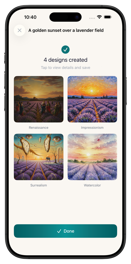
This is where generating your own art has a real advantage. With Wallora, you describe what you want, select an art style, and get paintings that share a consistent visual language. Need five impressionist landscapes with a blue-and-gold palette? Generate them in minutes. Want three minimalist abstract pieces that complement each other? Done. You control the subject, style, and mood, so cohesion is built in from the start.
Print them at your preferred size, frame them consistently, and you have a gallery wall collection that looks intentionally curated, because it was.
A gallery wall isn't something you rush through on a Saturday afternoon. Plan the layout, find the unifying thread, cut the paper templates, and take your time. The wall will be there tomorrow. Do it once, do it right, and you'll have a feature wall that actually looks like you meant it.