You're staring at a blank wall. You know it needs art, but the options are overwhelming. Impressionist, abstract, minimalist, pop art. These labels get thrown around constantly, but what do they actually mean for your space? And more importantly, which one will make your room feel like yours?
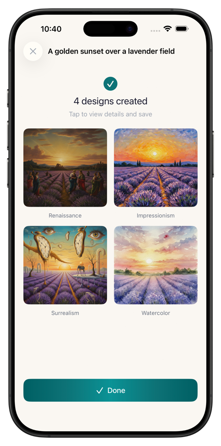
This guide breaks down the most popular painting styles, what makes each one visually distinct, and which rooms and decor styles they complement best. If you want to see how a specific style would look on your own wall before buying anything, Wallora generates AI paintings in 15 styles and previews them in room environments, so you can try before you commit.
Quick Comparison
| Style | Mood | Best Rooms | Pairs With |
|---|---|---|---|
| Impressionist | Warm, dreamy | Living room, dining room | Traditional, transitional decor |
| Abstract | Bold, energetic | Living room, office | Modern, contemporary decor |
| Minimalist | Calm, clean | Bedroom, hallway | Scandinavian, Japanese decor |
| Watercolor | Soft, airy | Bedroom, nursery | Coastal, bohemian decor |
| Oil Painting | Rich, classic | Dining room, study | Traditional, maximalist decor |
| Pop Art | Playful, vibrant | Home office, game room | Eclectic, retro decor |
| Surrealist | Thought-provoking | Study, gallery wall | Eclectic, maximalist decor |
| Japanese Ink | Serene, refined | Bedroom, meditation space | Japanese, minimalist decor |
| Botanical | Fresh, organic | Kitchen, bathroom, hallway | Farmhouse, coastal decor |
| Geometric | Structured, modern | Office, entryway | Mid-century modern decor |
Impressionist
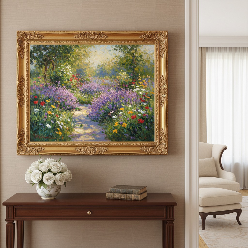
Think Monet's water lilies, Renoir's sun-dappled gardens. Impressionism captures light and atmosphere rather than precise detail. Brushstrokes are visible and loose, colors blend optically rather than on the canvas, and the overall effect is warm, soft, and slightly dreamlike.
What to look for: Visible brushwork, soft edges, emphasis on natural light, landscapes and everyday scenes. Colors tend toward warm pastels and rich, natural tones.
Best rooms: Living rooms and dining rooms where you want warmth without intensity. Impressionist pieces create conversation without demanding attention. They work especially well in spaces with natural light, where the painted light echoes the real light coming through windows.
Decor match: Traditional and transitional interiors. Pairs beautifully with warm wood furniture, linen upholstery, and muted color palettes. Avoid ultra-modern, stark white spaces where the soft edges can feel out of place.
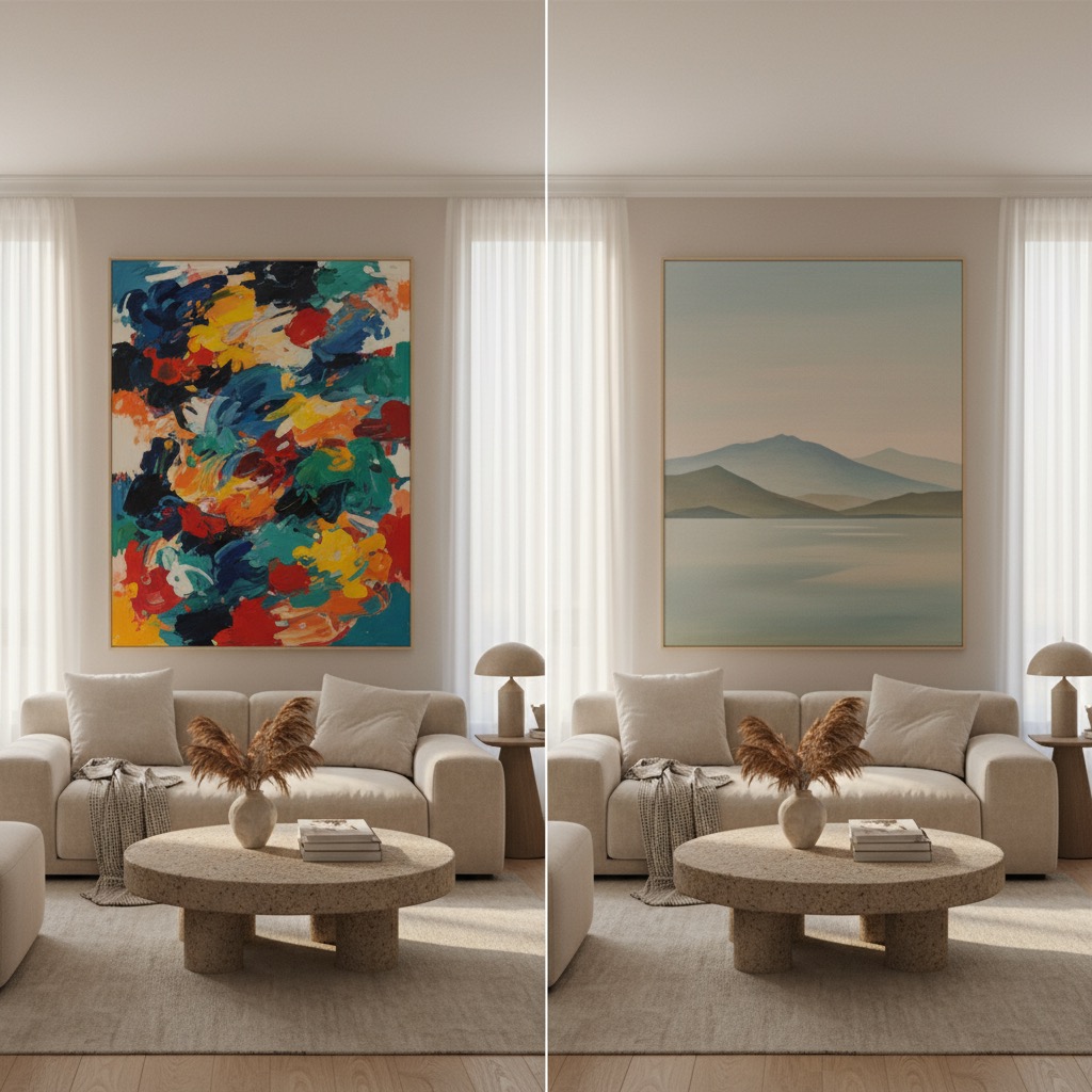
Abstract
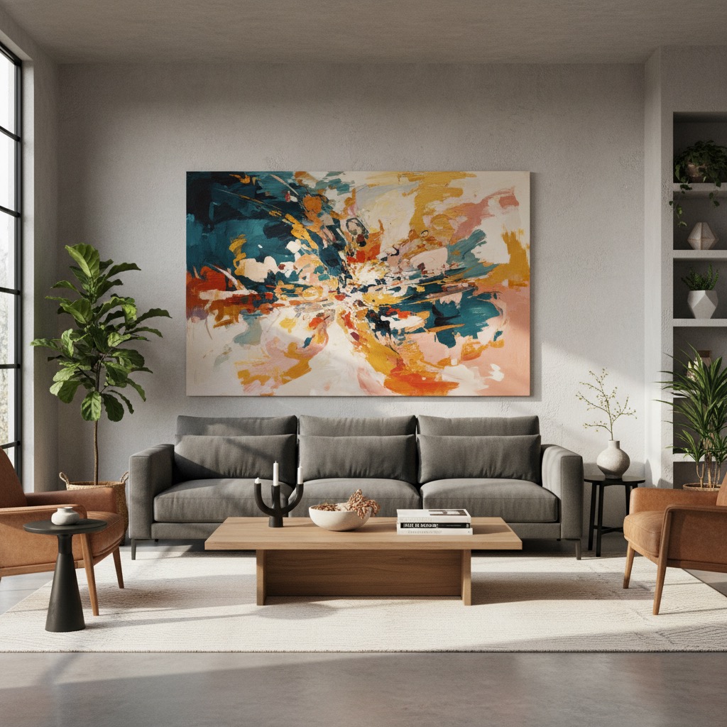
Abstract art doesn't represent recognizable objects. Instead, it communicates through color, shape, form, and texture. It ranges from bold geometric compositions to fluid, organic expressions. The common thread is that it asks you to respond emotionally rather than intellectually.
What to look for: Strong color relationships, intentional composition, texture and layering. Good abstract art has structure even when it looks spontaneous. The difference between good abstract art and random paint splashes is deliberate decision-making in every brushstroke.
Best rooms: Living rooms where you want a focal point, and home offices where you want visual energy without distraction. Abstract art excels as a single large statement piece above a sofa or on an accent wall.
Decor match: Modern and contemporary spaces. Clean-lined furniture, neutral bases with pops of color. Abstract art often provides the color palette for the entire room, so pick up one or two colors from the painting for cushions, throws, or accents.
Minimalist
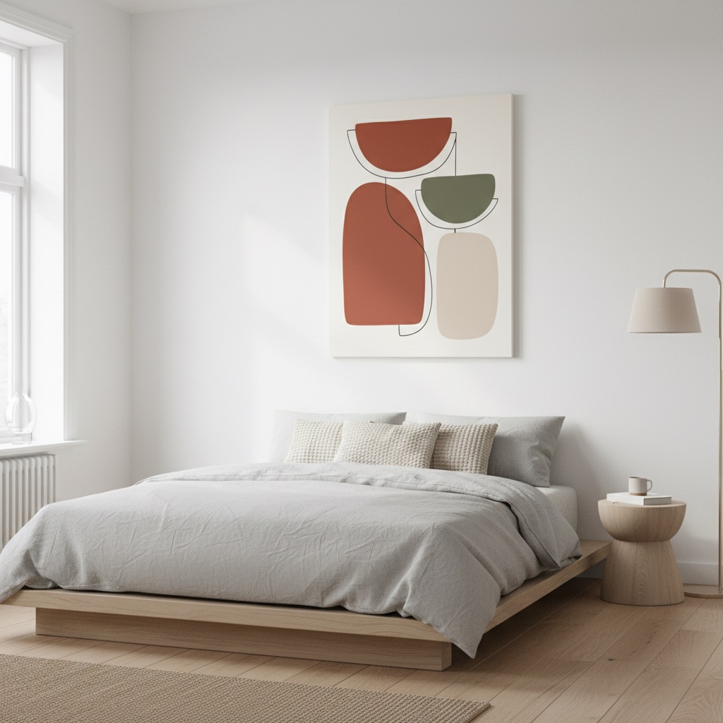
Minimalist art strips away everything unnecessary. A single line, a color block, a geometric shape on empty space. It's the visual equivalent of a deep breath. The power comes from what's not there as much as what is.
What to look for: Clean lines, limited color palettes (often monochrome or two-tone), generous negative space, simple shapes. The best minimalist art achieves maximum impact with minimum elements.
Best rooms: Bedrooms where calm matters most, hallways where simplicity prevents clutter, and bathrooms where clean aesthetics align with the space. Minimalist pieces also work well in small spaces because they don't visually compete with furniture and accessories.
Decor match: Scandinavian interiors, Japanese-inspired spaces, and any room with a "less is more" philosophy. Pairs perfectly with light wood, white walls, and simple furniture. Minimalist art in a cluttered room just looks lost.
Watercolor
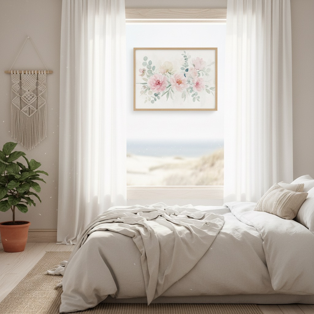
Watercolor paintings have a transparency and lightness that no other medium matches. Pigment bleeds softly into wet paper, creating gradients and edges that feel organic and alive. The white of the paper shows through, giving everything a luminous, airy quality.
What to look for: Soft color gradients, visible paper texture, translucent layers, flowing edges. Subjects are often botanicals, landscapes, or abstract washes. The spontaneous quality of watercolor means no two pieces feel manufactured.
Best rooms: Bedrooms and nurseries where softness matters. Guest rooms where you want warmth without personality overload. Bathrooms where the aquatic, flowing quality feels natural.
Decor match: Coastal decor, bohemian interiors, and feminine spaces. Works with light fabrics, natural textures, and pastel or muted color schemes. Watercolor art in a dark, moody room creates an interesting contrast, but it needs to be intentional.
Oil Painting
Oil painting is the heavyweight of art media. Rich, layered, with a depth and luminosity that comes from building translucent glazes over opaque layers. Traditional oil paintings have a presence that fills a room. They feel substantial and permanent.
What to look for: Rich color depth, visible texture from thick paint application (impasto), detailed rendering of light and shadow. Subjects range from classical portraits and still lifes to landscapes and contemporary scenes.
Best rooms: Dining rooms where the richness matches evening entertaining. Studies and libraries where gravitas matters. Living rooms where you want a classical anchor. Oil paintings demand good lighting. A picture light or directional spotlight transforms them.
Decor match: Traditional interiors, maximalist spaces, and rooms with dark wood, leather, and rich textiles. A single well-chosen oil painting can transform an entire room from furnished to curated.
Pop Art
Pop art exploded in the 1960s with Warhol and Lichtenstein, turning commercial imagery into fine art. Bold colors, graphic lines, halftone dots, and cultural references define the style. It's playful, irreverent, and unapologetically eye-catching.
What to look for: Saturated primary colors, graphic outlines, repetition, commercial or pop culture imagery. The style bridges fine art and graphic design, often with a sense of humor.
Best rooms: Home offices where energy matters, game rooms, creative studios, and kitchens where a splash of personality livens up a functional space. Pop art doesn't do subtle, so save it for rooms where you want to make a statement.
Decor match: Eclectic and retro-modern interiors. Works surprisingly well against industrial elements (exposed brick, concrete, metal shelving). Pair with simple, modern furniture so the art is the star. Too much competing pattern and color creates chaos.
Surrealist
Surrealism paints impossible scenes with realistic precision. Melting clocks, floating objects, impossible architecture, dreamlike juxtapositions. It makes you look twice and think about what you're seeing.
What to look for: Technically skilled rendering of impossible subjects. Dream logic, unexpected scale relationships, symbolic imagery. The best surrealist art feels like a vivid dream that you can almost remember.
Best rooms: Studies and reading rooms where thought-provoking art enhances the intellectual atmosphere. Gallery walls where it can be part of a curated collection. Hallways where a surrealist piece becomes a surprising moment of discovery.
Decor match: Eclectic, maximalist spaces that welcome conversation pieces. Works well in otherwise understated rooms as a single disruptive element. Avoid placing surrealist art where it needs to function as background. It demands attention.
Japanese Ink (Sumi-e)
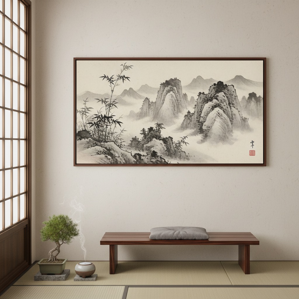
Japanese ink painting uses black ink in varying dilutions to capture the essence of a subject in the fewest possible strokes. Mountains emerge from mist, bamboo bends in wind, birds perch on bare branches. Every brushstroke is intentional and visible. Nothing is overworked.
What to look for: Monochrome or limited palette (black ink with occasional muted color), visible brushwork, generous empty space (ma), natural subjects rendered with poetic simplicity. The empty space is as important as the painted areas.
Best rooms: Bedrooms and meditation spaces where serenity matters. Bathrooms for a spa-like atmosphere. Entryways where a single ink painting creates a calm first impression.
Decor match: Japanese and Japanese-inspired interiors, minimalist spaces, zen-influenced decor. Pairs with natural materials like wood, stone, and paper. The clean simplicity works with neutral palettes and simple lines.
Botanical
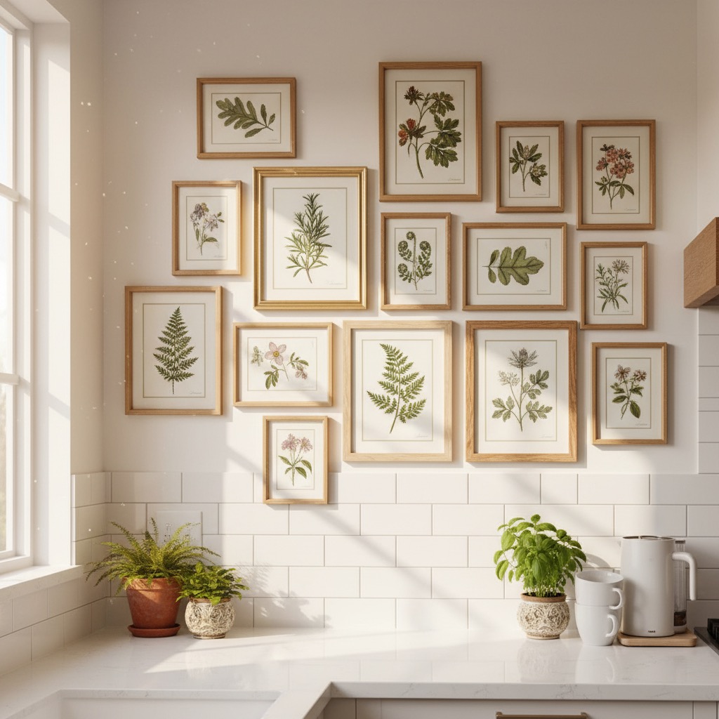
Botanical art documents plants with both scientific precision and artistic beauty. Detailed leaves, flowers, fruits, and seeds rendered in vibrant natural colors. The tradition stretches back centuries, from scientific illustration to contemporary decorative art.
What to look for: Detailed, accurate plant rendering, natural color palettes (greens, earth tones, floral colors), white or light backgrounds, elegant composition. Can range from vintage scientific illustration style to modern, painterly interpretations.
Best rooms: Kitchens where the organic subject matter connects to food and nature. Bathrooms for a fresh, clean feel. Hallways and entryways where botanicals add life without overwhelming. Gallery walls of multiple botanical prints create a stunning effect.
Decor match: Farmhouse, coastal, and transitional interiors. Works beautifully with natural materials, greenery, and earthy color palettes. Botanical art brings the outdoors in, so it pairs well with actual plants.
Geometric
Geometric art builds compositions from precise shapes, patterns, and mathematical relationships. Hard edges, clean lines, and deliberate color placement create order and rhythm. It ranges from simple color-blocked compositions to complex tessellations and optical illusions.
What to look for: Precise lines and shapes, intentional color relationships, symmetry or deliberate asymmetry, pattern and repetition. The best geometric art has a satisfying visual logic that rewards close viewing.
Best rooms: Home offices and workspaces where structured visual energy supports focus. Entryways where a bold geometric piece makes a strong first impression. Dining rooms where the precision complements formal table settings.
Decor match: Mid-century modern interiors, contemporary spaces, and any room with clean architectural lines. Geometric art echoes the structure of the room itself. Pair with furniture that has clean silhouettes and intentional proportions.
How to Choose the Right Style
Knowing the styles is step one. Here's how to narrow it down for your specific space.
Start with the room's purpose. A bedroom needs calm (minimalist, watercolor, Japanese ink). A living room needs presence (abstract, impressionist, oil). A home office needs energy without distraction (geometric, abstract). The art should serve the room's function, not fight it.
Match your existing decor. Look at what you already have. Modern furniture with clean lines points toward abstract, minimalist, or geometric. Traditional furniture with curves and warmth points toward impressionist, oil, or botanical. Going against type can work, but it requires confidence.
Consider the wall. Large blank walls need large pieces or curated gallery arrangements. Small walls between doorways need simple, focused pieces. The art should fill roughly two-thirds to three-quarters of the available wall width for proper visual weight.
Think about color. Art can either complement your room's palette (safe, harmonious) or provide contrast (bold, energetic). A cool-toned abstract painting in a warm-toned room creates tension that feels intentional. Matching too perfectly can feel sterile.
Test before you buy. This is where seeing art in context makes the biggest difference. A painting that looks perfect on a gallery website might overwhelm your small bedroom or disappear on your large living room wall.

With Wallora, you describe what you're imagining, pick from 15 art styles, and preview the generated painting in a room environment that matches yours. Try the same scene in impressionist, then abstract, then minimalist. You'll see immediately which style works for your space.
Room-by-Room Recommendations
Living room: This is your showcase wall. Go bold. Abstract, impressionist, or oil painting. Large scale, centered above the sofa or on the most visible wall. This piece sets the tone for the entire room.
Bedroom: Prioritize calm. Watercolor, minimalist, Japanese ink, or soft impressionist landscapes. Keep colors muted and subjects peaceful. Art above the headboard should feel restful, not stimulating.
Home office: Match your work energy. Geometric and abstract art for focus. Pop art if your work is creative. Avoid overly busy compositions that compete with your screen.
Dining room: Art here is part of the entertaining experience. Oil paintings, impressionist still lifes, or bold abstracts that spark conversation. The formality of the art should match the formality of your dining style.
Hallway and entryway: First impressions matter. A single striking piece (geometric, botanical, minimalist) or a curated gallery wall mixing styles. Keep it simple. Hallways are transition spaces, not destinations.
Kitchen: Botanical art is a natural fit. Food-related subjects work if they're well-executed. Avoid large, precious pieces in a space prone to grease and steam. Smaller framed prints in protective glass are practical.
Nursery: Watercolor animals, soft botanicals, or simple minimalist shapes. Gentle colors, nothing visually harsh. The art will be background to sleep and play, not a focal point.
Common Mistakes
Hanging too small. The most common mistake. A tiny frame on a large wall looks like an afterthought. When in doubt, go bigger. A single large piece has more impact than three small ones scattered randomly.
Ignoring the frame. The frame is part of the art. A sleek black frame suits modern and minimalist work. An ornate gold frame suits classical oil paintings. A thin floating frame suits contemporary pieces. Mismatched frames and art styles create visual confusion.
Matching too literally. Your art doesn't need to match your throw pillows. Coordinating is fine; matching is boring. Art should add something new to the room, not repeat what's already there.
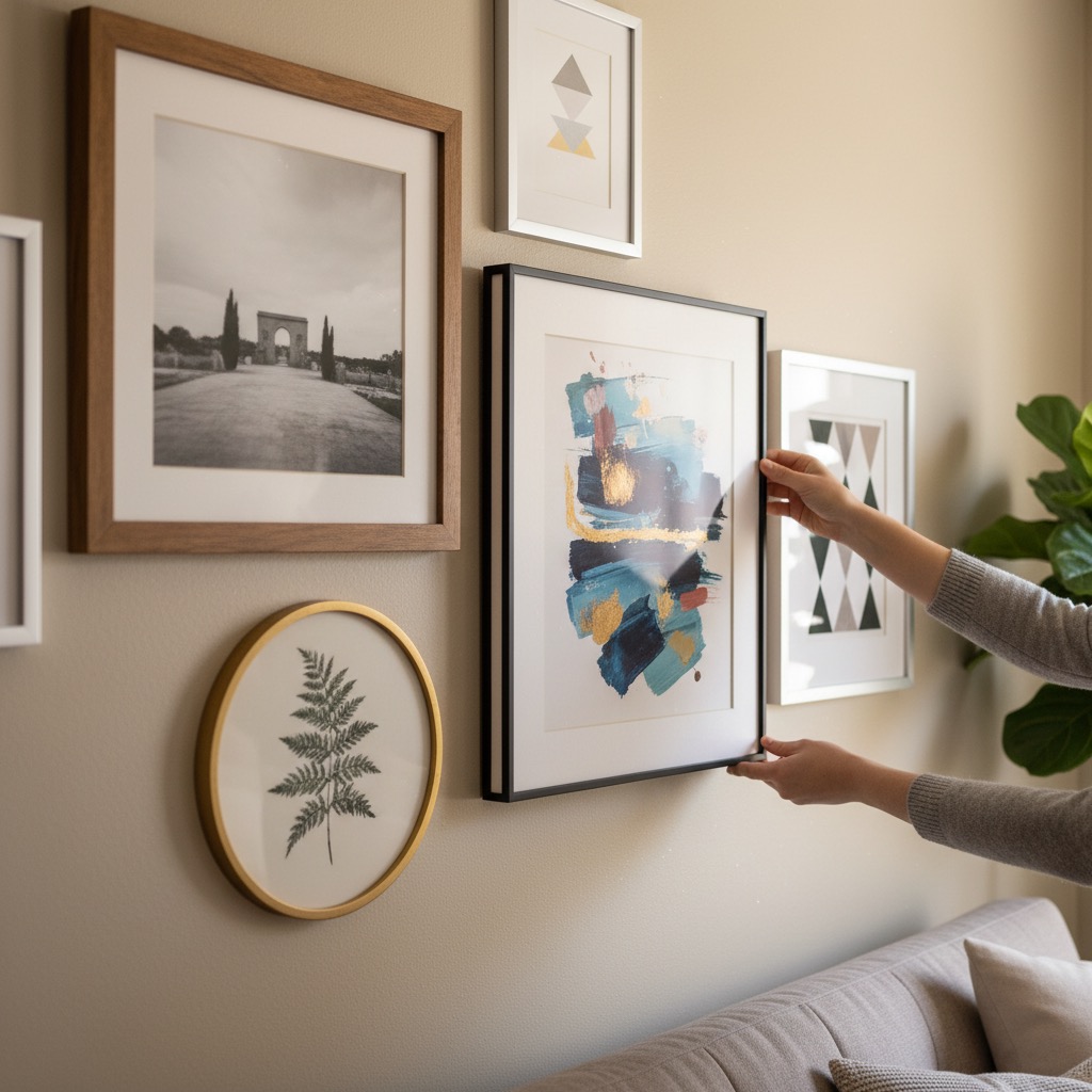
Gallery walls without cohesion. Mixing styles works when there's a unifying thread, like consistent frame style, shared color palette, or similar scale. Without that thread, a gallery wall just looks like a yard sale.
Forgetting about lighting. Art without proper lighting is invisible by evening. A picture light, track lighting, or well-placed floor lamp transforms how art reads in a room. Plan lighting before you hang.
Hanging It Right
Center at eye level. The center of the artwork should sit at roughly 57-60 inches from the floor (average eye level in galleries). Above a sofa, leave 6-8 inches between the top of the furniture and the bottom of the frame.
The two-thirds rule. Art above furniture should be roughly two-thirds the width of the furniture below it. A 6-foot sofa needs art that's about 4 feet wide. This creates visual balance.
Gallery wall spacing. Keep 2-3 inches between frames for a cohesive look. More space between frames makes each piece feel isolated. Less space feels crowded.
Lean, don't always hang. Larger pieces on a shelf, mantel, or floor look intentionally casual. This works especially well with contemporary and abstract art, and lets you swap pieces easily.
Find Your Style
The right art transforms a room from furnished to finished. It reflects your taste, sets the mood, and gives walls a reason to exist. The hard part isn't finding art you like. It's finding art that works in your specific space.
Start experimenting. Describe a scene, pick a style, and see it on a wall with Wallora. Try impressionist for the living room, minimalist for the bedroom, botanical for the kitchen. When you find a style that clicks, you'll know.
Your walls are waiting.